Last week, we presented our Q2 2020 – Frequently Asked Questions (FAQ) blog post. Today, we would like to present the first half 2020 market update with some charts of interest.
1. 2020 Equity returns year-to-date
The first half the year saw a continuation of market increases until late-February, when COVID-related fears took hold of markets. After a steep decline – including the fastest 20% drawdown time of 19 business days in history – markets rallied from early-April to the present.
Here, we see market returns in domestic currency terms (YTD) and in Canadian Dollar terms (YTD C$), as of July 24, 2020. Note that “EAFE” stands for “Europe, Australasia and Far East”, and is a stock market index measuring equity performance of developed markets outside Canada & the U.S.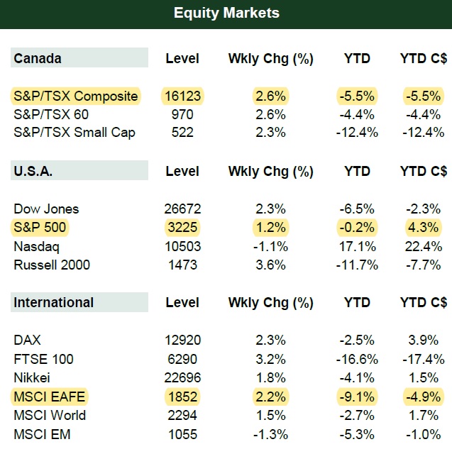
2 & 3: S&P 500 and international valuation measures
The chart below tracks various valuations methods for the S&P 500. Interestingly, the P/E ratio for the S&P 500 has actually increased from ~18.18 times earnings in December 2019 to ~21.72 times earnings as of June 30, 2020. This is due to declining earnings coupled with a rally in stock prices.
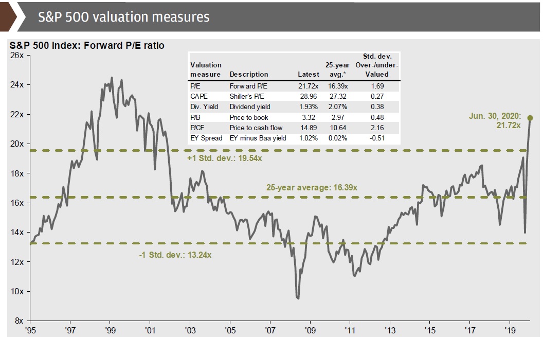
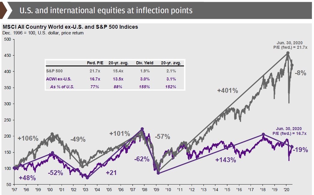
International equity markets remain cheaper relative to U.S. equities, though international P/E ratios have similarly risen – again due to reduced earnings & stock price rallies.
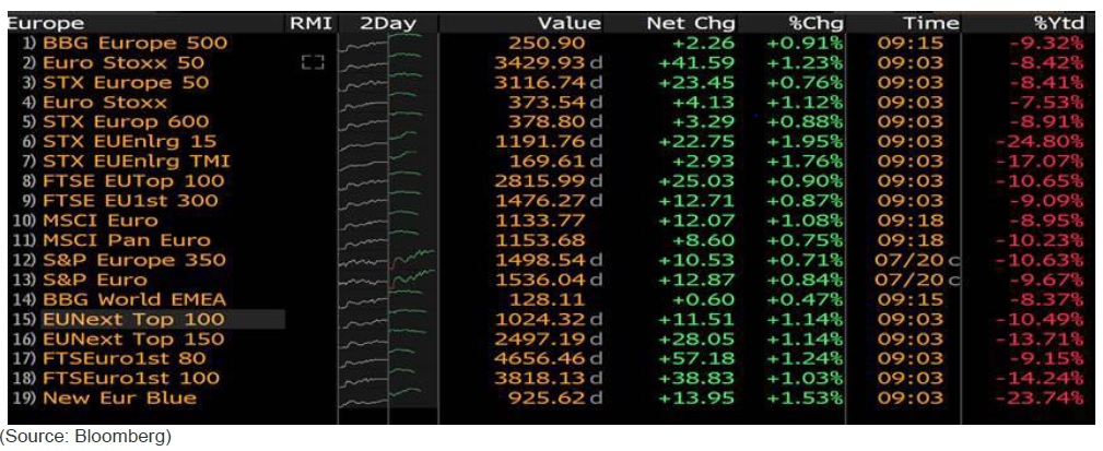
4: European COVID stimulus package
The screenshot below is as of mid-day on July 23, 2020. Commentary from Myles Zyblock, Chief Investment Strategist at Dynamic Funds, follows:
“Markets are green to start the day, particularly in Europe where many of those indexes are up by about 1%. This positive tone was set by a breakthrough agreement early Tuesday (July 21, 2020) morning between EU leaders on a 1.82 Trillion Euro ($2.1 Trillion USD) “European” budget and coronavirus recovery fund. In the details, we were told that 750 Billion Euros will be for coronavirus support (comprised of 390 Billion Euros in grants and 360 Billion Euros in loans) and 1.07 Trillion Euros will be placed towards a seven-year budget.
This is new. It is the first time the region is raising debt collectively to fund a response to a crisis. The debt issued will be in the form of a Eurobond. While the EU recovery fund disbursement is unlikely to start until 2021, national fiscal policy plus the ECB’s efforts will continue to provide the main avenues for support. Nevertheless, this is a big unifying policy step for the region and it is a large source of fresh fiscal stimulus for the year ahead”. (end of Myles Zyblock commentary)
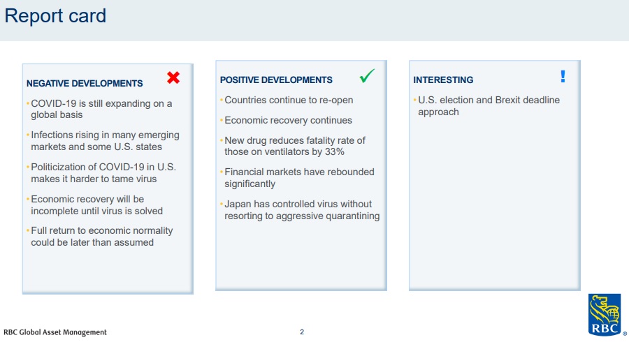
5: Economic report card
From RBC Global Asset Management (RBC GAM), here is an overview of current positive, negative, and interesting market developments. The “interesting” category consists of items that may end up positive or negative when the dust settles.
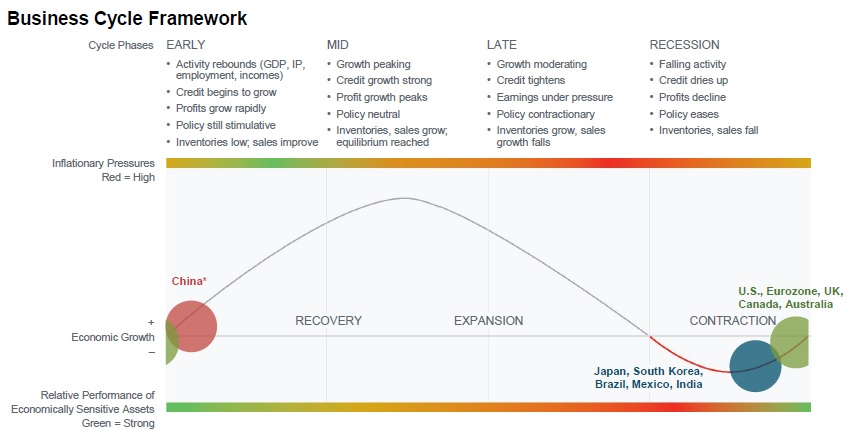
6 & 7: Most countries are exhibiting recessionary market signals
Another RBC GAM chart. The majority of economic metrics (63%) indicate the U.S. is in a recessionary phase, with a small slice of metrics (17%) indicating the U.S. is in the “end of cycle” phase.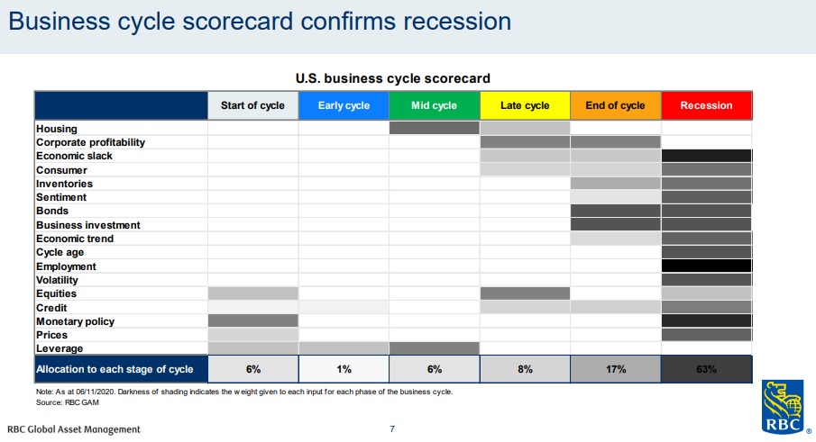
This chart, from Fidelity, echoes the above chart and provides international context. Global activity shows early signs of improvement from extremely low levels. Near-term sequential progress is likely to continue as coronavirus-related restrictions on routine activities are lifted. China appears to be somewhat ahead of most major economies due to its earlier shutdown and reopening. While the worst of the recession appears to have passed for the U.S. and Europe as well, activity levels remain far below normal. In addition, “second wave” risks remain present.
8: Unemployment & wages
In January’s 20 Charts for 2020, we noted that unemployment in the U.S. hit a 50-year low. As we see here, the COVID-related economic shutdown led to 50-year high unemployment levels. Wage growth also moved downward toward its 50-year historical average.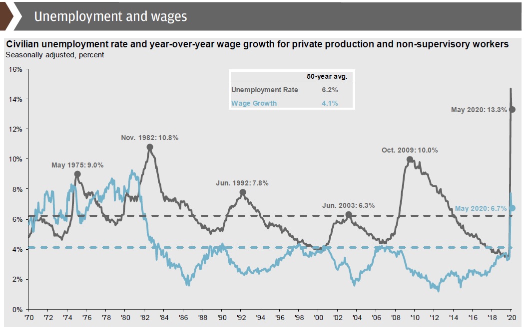
9: Inflation has decreased from late-2019 to the present day
U.S. inflation, measured by the personal consumption deflator, was at 1.6% as of November 2019. The economic shutdown and unemployment spike had a predictable effect, as inflation dropped to 1.0% as of June 30, 2020. U.S. Fed Chairman Jerome Powell stated in June that the Fed is “not even thinking about thinking about raising rates”.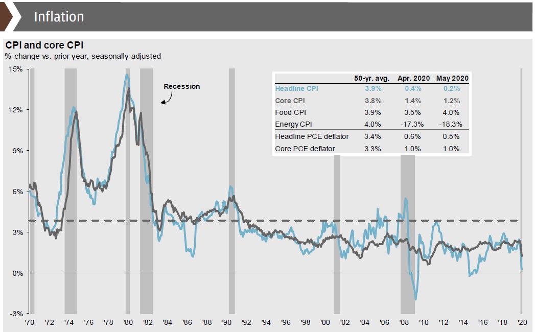
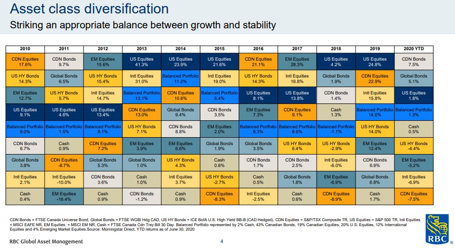
10: Mitigating risk through broad diversification
We consistently return to charts like this because this lesson never gets old. The best way to optimize risk-adjusted returns is to invest in a well-diversified portfolio, both from a regional and from a sector standpoint.
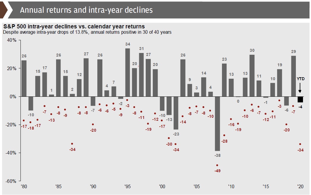
11: Intra-year declines happen every year
History tells us that the majority of calendar years see at least one market pullback of 5% or more. 2019 provided a great example of this, with a -7% decline during the year but a 29% return in the end. In 2020, the S&P declined as much as -34% and currently sits at -4% as of June 30, 2020.
12: Bear (declining) markets are historically shorter than bull (rising) markets
Using data going back to The Great Depression, we’ve seen that the average bear market is 22 months and sees a -42% decline, while the average bull market has seen a duration of 54 months and a return of 166%.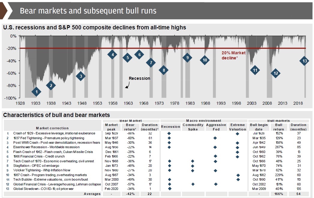
Sources: Dynamic Funds, Fidelity, JP Morgan, RBC GAM
This information is provided for general information purposes only. It does not constitute professional advice. Please contact a professional about your specific needs before taking any action.