20 Charts for 2021
We have turned the page on a difficult and turbulent 2020. However, there are signs that the current upward market trend can continue. Here are 20 of our favourite charts heading into 2021, organized into the following categories:
-2020 Index Returns
-Economy
-COVID and Sector Returns
-Market Analysis
-Central Banks and Inflation
-Asset allocation and Portfolio Construction
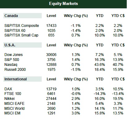
2020 Index Returns
Here are the major index returns for 2020. Most indexes were positive, though there was a large gap between the largest gainers (Nasdaq) and the more modest ones(TSX).
Economy
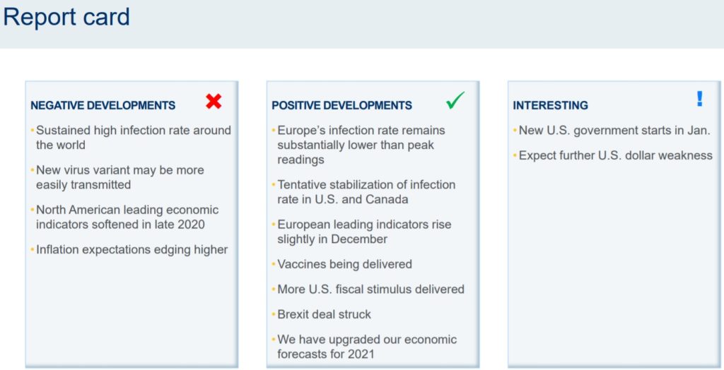
Report card: Here is an overview of recent positive and negative developments as we turn the page on 2020 and look to 2021. The “interesting” category (items of interest which may end up positive or negative) centers on the new U.S. government with President Biden and the potential of a soft U.S. dollar.
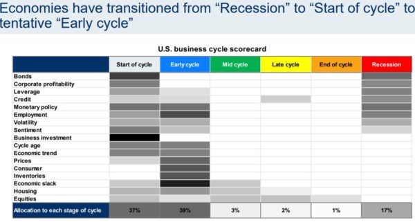
Business cycle “reset” due to COVID: Heading into 2020, this chart indicated the U.S. was most likely in a “late cycle” or “end of cycle” phase. COVID changed everything. The two most likely stages at this point are “early cycle” or “start of cycle”, with “recession” a distant 3rd.
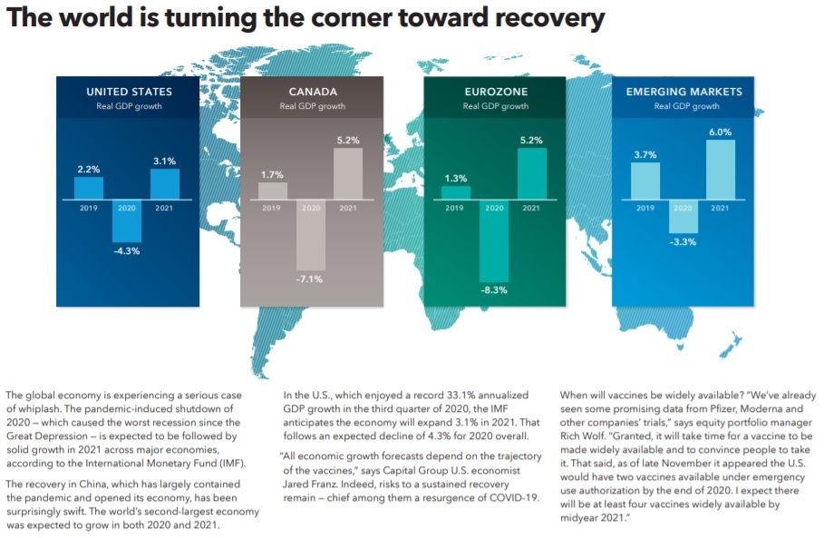
Turning the corner toward recovery:
COVID and Sector Returns
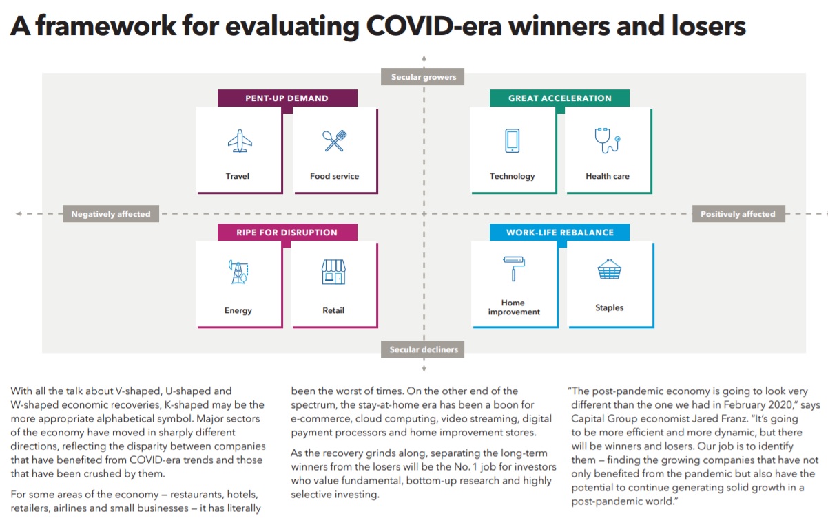
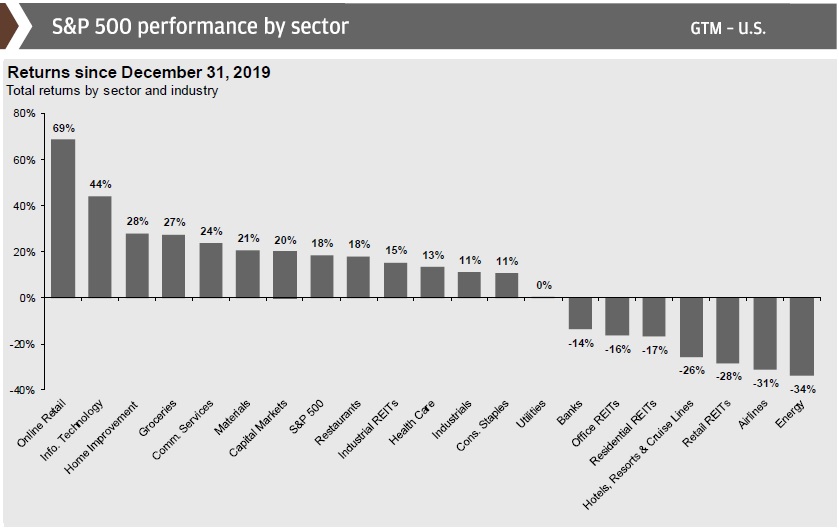
Winners and losers: The two charts below give a quick view of the sector-based winners and losers from the COVID pullback.
The impact of technology on 2020 S&P 500 and TSX returns: The overnight creation of a “stay-at-home” economy was great news for tech stocks.
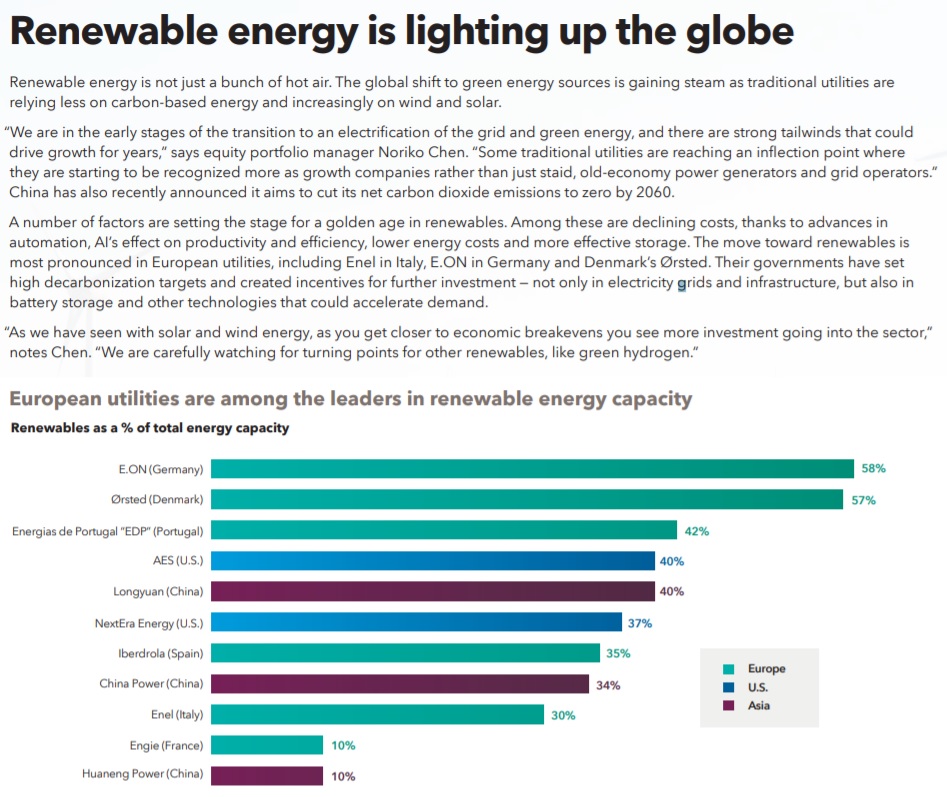
Strong year for green energy: Green energy continues to grow its market share and experienced strong returns last year.
Market Analysis
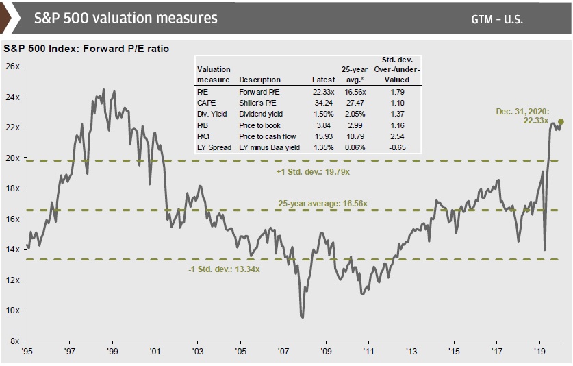
U.S. equity valuations to end 2020 increased year-over-year: As we see higher valuations, we should lower return expectations accordingly. Currently, U.S. forward P/E ratios are about 22.33 times earnings, compared to the 25-year average of about 16.3 times earnings. The forward P/E was 19.3 times earnings at the end of 2019.
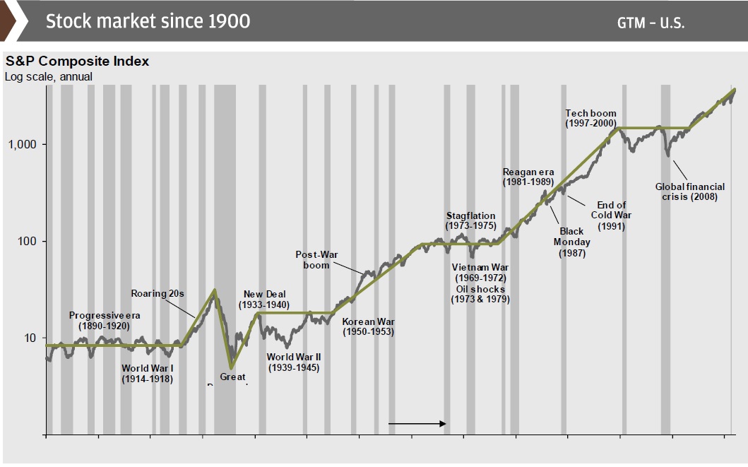
The S&P 500 since 1900: Here we see the steady growth in the S&P 500 since 1900.
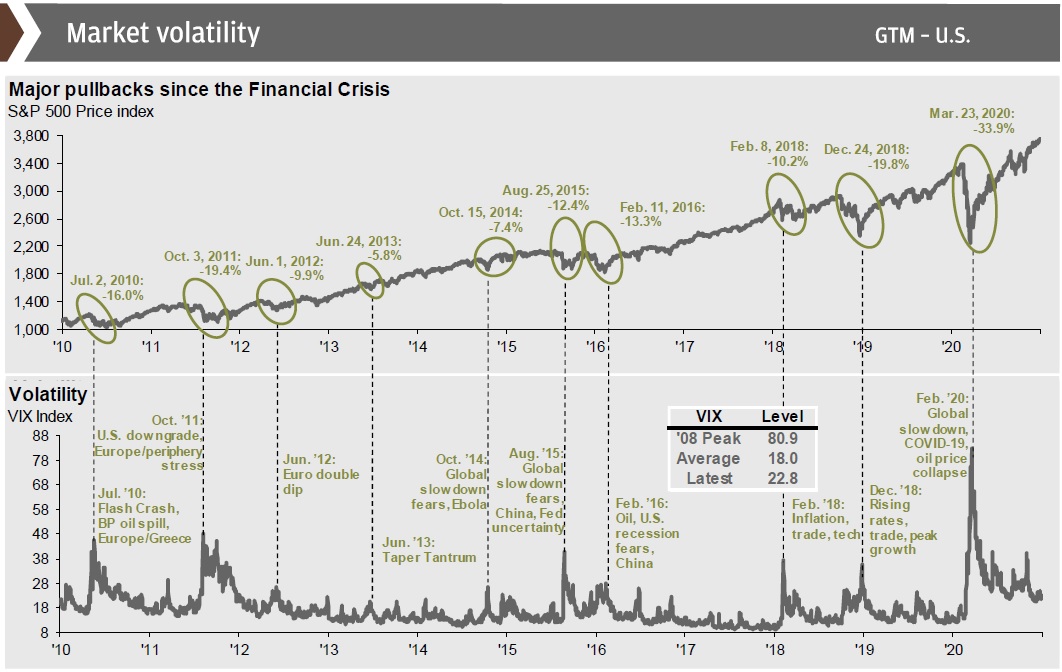
The S&P 500 and market volatility: Here, we see the major pullbacks the S&P 500 has experienced since 2010 and the subsequent recoveries.
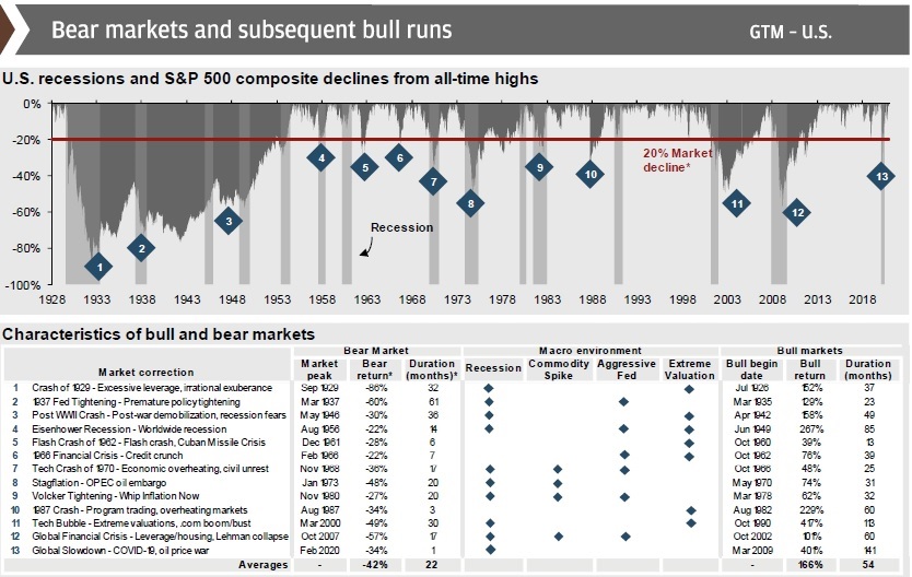
U.S. bulls are longer and stronger than bears: Using data going back to The Great Depression, we see that the average S&P 500 bull market is 54 months, and the average total return is 166%, whereas the average bear market lasts 22 months but sees a 42% drop. Once again, the average bull market lasts longer and gains more than the preceding bear market lasts & drops. Note that the COVID-related recession lasted only 1 month and saw a 34% drop.
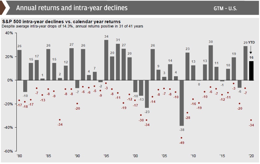
Intra-year declines happen every year, don’t panic! History has shown that a large majority of calendar years see at least one drawdown of 5% or more. Years like 2017, where markets truly head upward with no real speedbumps, are exceedingly rare. It is generally a good idea to ride out the volatility, as markets always rebound given time.
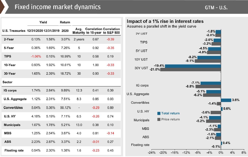
Weak outlook for fixed income: With central bank rates at emergency lows, bond yields have followed suit. Medium-term return projections for the fixed-income space are in the low single-digits:
Central Banks, Fiscal Stimulus, and Inflation
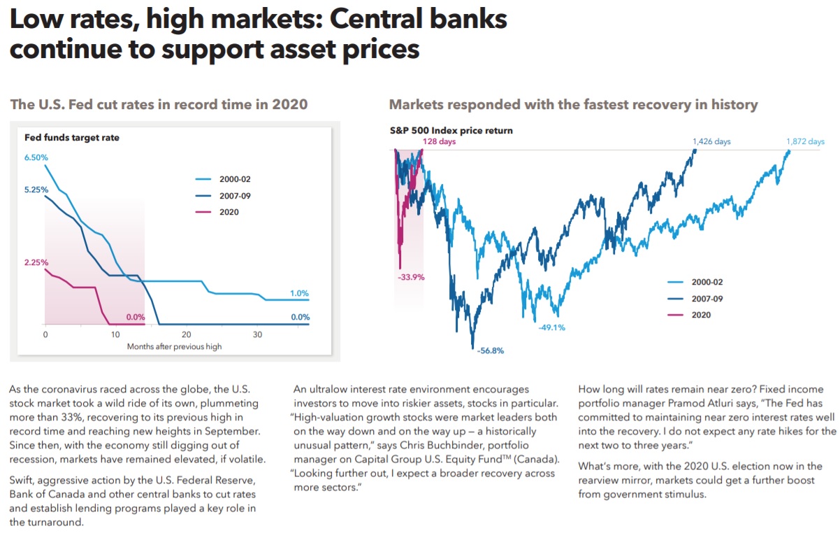
U.S. Fed made a series of emergency rate cuts: During the first wave, drastic action was taken by the U.S. Fed as they made a series of emergency rate cuts. Currently the Fed’s key rate is 0.25%, as is the Bank of Canada’s key overnight rate. The EU overnight is at 0%.
Inflation should be low in the near term but will rise in the long term: When so much money is injected into the overall money supply, rapid inflation becomes a long-term concern.
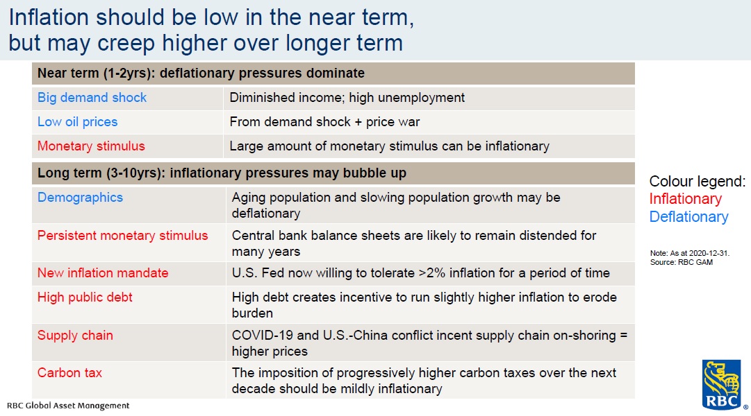
Inflation: Over the next 1-2 years, inflation should remain low but looking at a longer timeline, expect inflation to move upward.
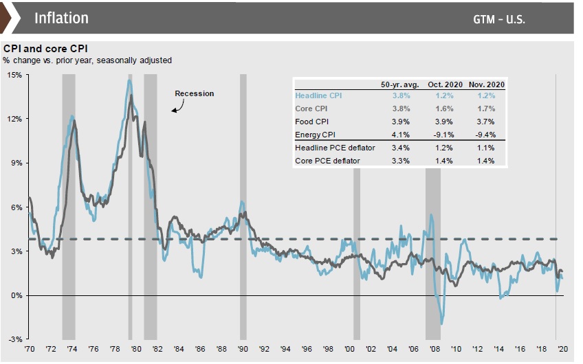
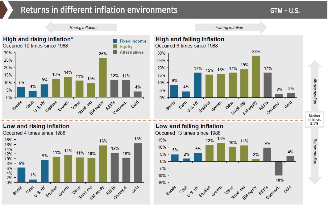
Inflation’s impact on market returns: As we see below, the inflation environment has historically influenced where returns are best derived. We are currently in a low inflation environment, and as our previous charts show, we expect inflation to remain low in the near-term, followed by upward movement.
Asset Allocation & Portfolio Construction
Can you commit for 10 years? Why does the industry always talk about a “long-term mindset”? The historical worst-case for stocks over any 10-year period since 1950 is -1%.
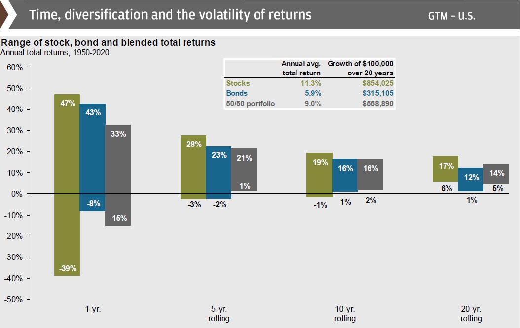
Broad diversification is a great risk-mitigator: If there’s only one chart you want to look at, this is the one. Diversification is one of the best risk mitigation strategies one can undertake.
Sources: Capital Group, JP Morgan, RBC GAM